

PRIMARY LOGO
IN-LINE LOGO
BRANDMARK

PRIMARY LOGO
BRANDMARK
Logo Clear Space
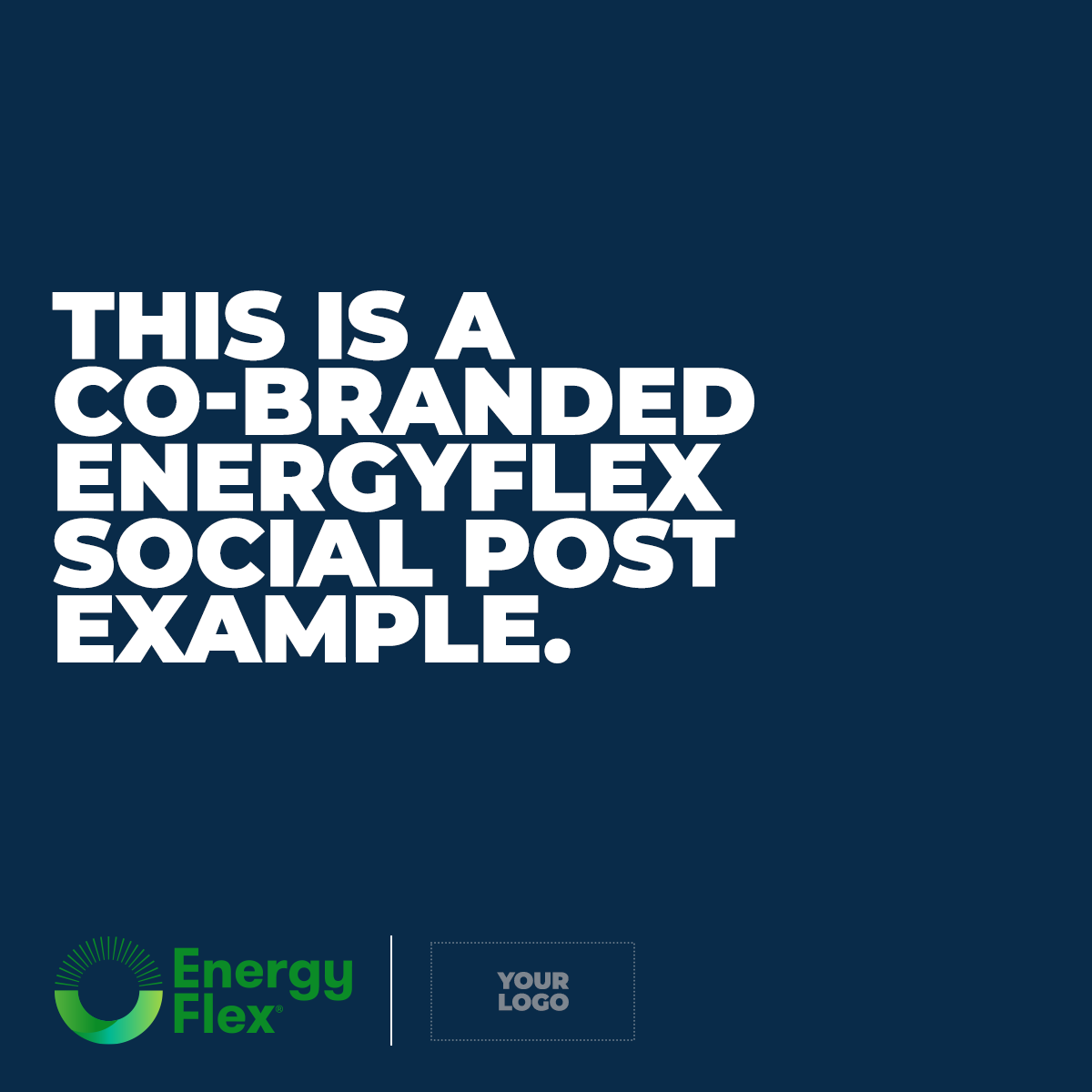
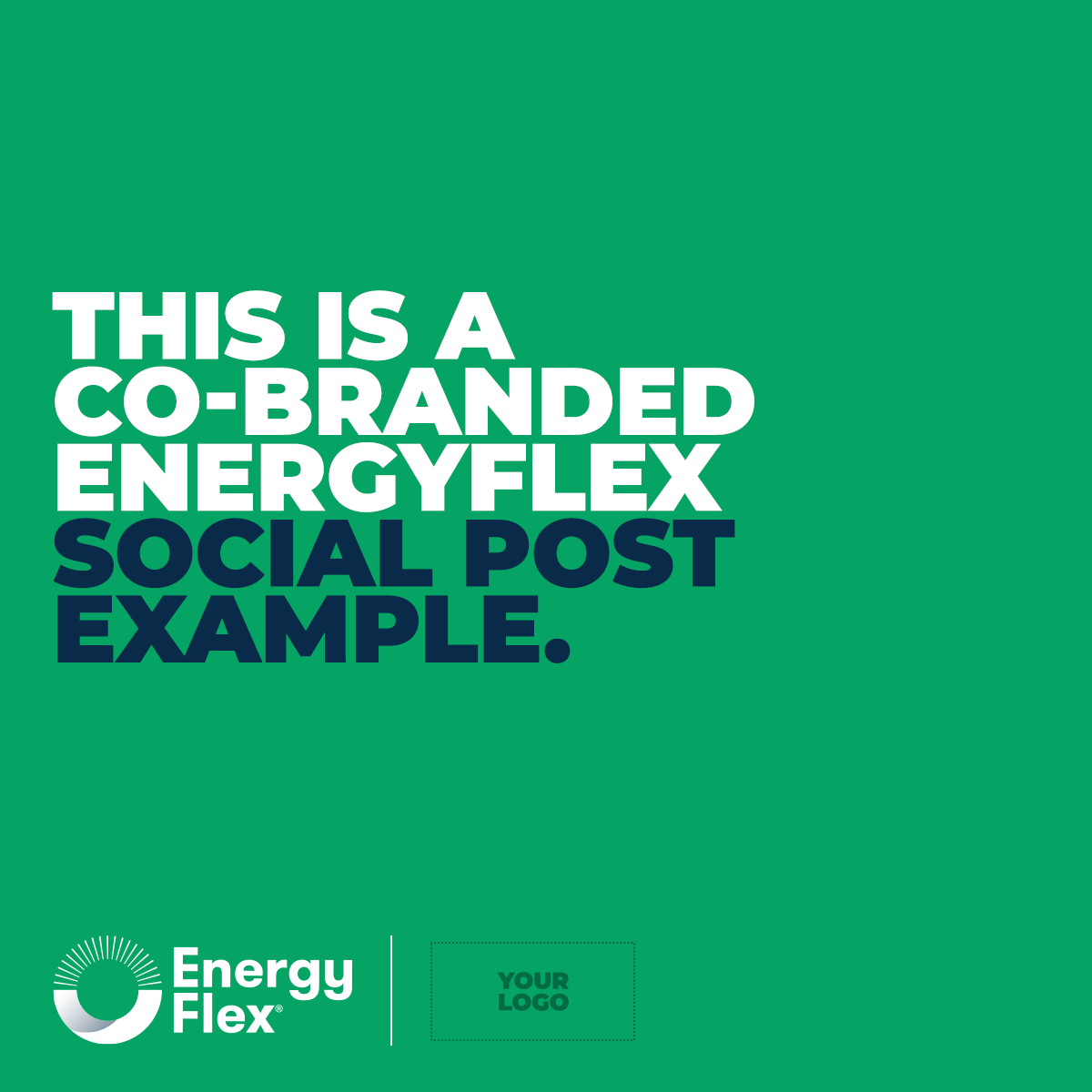
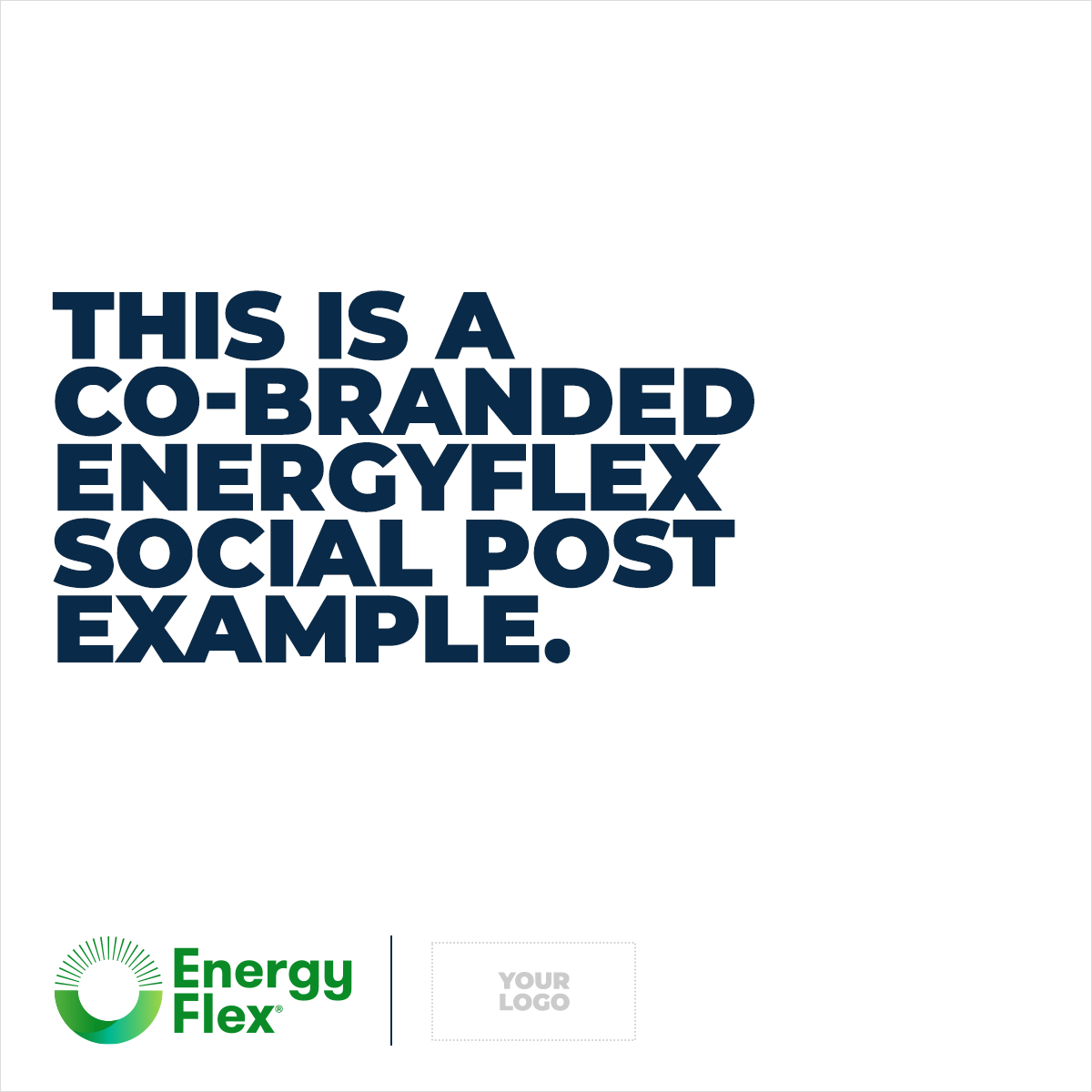
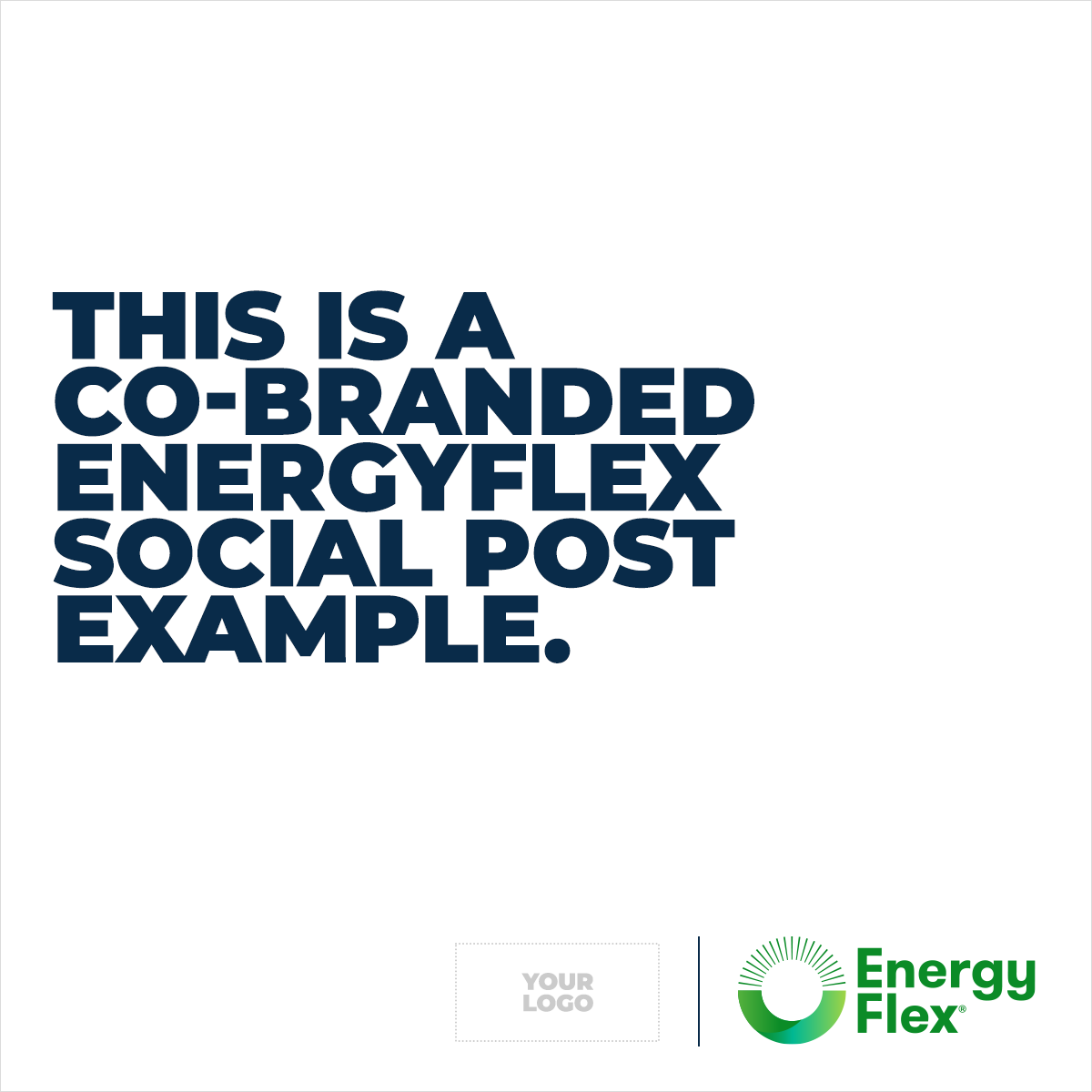
Logo Co-Branding


Unauthorised Use


