ENERGYFLEX
Brand
toolkit
This brand toolkit serves as a resource for partner brands and businesses to rollout community programs, and prepare co-branded assets using EnergyFlex materials.
CONTENTS
BRAND STATEMENT
At EnergyFlex, our mission is to give Australians the power to save money and help the planet by providing free tools and insights that help them manage their energy bills and carbon emissions.
We aim to inspire confidence and action, enabling Australians to become ‘Renewables Ready’ by monitoring and improving their unique EnergyFlex Rating.
When communicating with our audience, we adopt a tone that is empowering, friendly, witty and informative.
OUR AUDIENCE
Our message resonates with every Australian.
From mums and dads balancing family budgets, to young Australians learning about the impact of carbon emissions on our climate, and the retired community seeking sustainable cost-saving measures.
We are committed to engaging with everyone, to foster a unified movement towards changing how Australia uses energy.
By sharing knowledge and solutions across generations, we believe that together, we can create a more sustainable and energy-efficient future for Australia.
Saving the Planet is a team sport
Through collective action, EnergyFlex benefits large cohorts, and has the potential to deliver thousands of dollars in savings each year to your community, and a significant and measurable benefit for the environment.
Suitable for:
- Employee and benefits programs
- Customer engagement and rewards; and
- Increasing membership value.
HOW WE COMMUNICATE
TONE OF VOICE
Our tone of voice is not just about what we say, but also how we say it. We aim to make every interaction with EnergyFlex a positive and empowering experience. Our voice is an extension of our brand personality. It should always reflect our commitment to energy wellness, sustainability, empowerment, and innovation.
OUR VOICE IS:
- EMPOWERING
We inspire and motivate individuals and businesses to take control of their energy use and make positive changes. We believe that everyone has the power to make a difference. - APPROACHABLE
We’re friendly, conversational and relatable. We use clear, concise language that’s easy to understand, avoiding jargon and technical terms wherever possible. We want everyone to feel comfortable and confident using our platform. - OPTIMISTIC
We focus on solutions and possibilities, not problems. We believe in a sustainable, cleaner energy future, and in the power of collective action to combat climate change. - SUPPORTIVE
We’re here to help our users on their energy wellness journeys. We offer guidance, support, and encouragement every step of the way. We foster a sense of belonging and community among our users. - WITTY
We believe that learning about energy can be fun and engaging. We use humour, playful visuals, and interactive elements to make the experience of becoming Renewables Ready enjoyable.
CORE VALUES REFLECTED IN OUR VOICE:
- ENERGY DRIVES OUR BUSINESS
We are the energy wellness experts. We promote a holistic approach to energy management, emphasising its impact on well-being, finances, and the environment. - NEVER GREENWASH
We are passionate about renewable energy and advocate for a greener future. We want to inspire others to join us in creating a more sustainable world. - IDEAS ARE EVERYTHING
We embrace technology and data to create innovative solutions for energy challenges. We know our stuff, but we explain it in a way that everyone can understand.
HOW WE COMMUNICATE:
- Clear and concise language: Keep it simple and avoid technical jargon.
- Positive and encouraging tone: Focus on solutions, not problems. We want our audience to feel empowered and supported, not overwhelmed or intimidated.
- Visually appealing: We use images, graphics, and videos to bring our message to life and make energy data more accessible.
- Personalised: We tailor our communication to individual needs and preferences.
- Consistent: We maintain a consistent voice across all our communication channels, from our website and app to our social media platforms and customer interactions.
KEY PRINCIPLES
- Know your audience – Understand your target audience (individuals, businesses, etc.) and tailor your language accordingly.
- Use active voice – Keep your writing dynamic and engaging.
- Be conversational – Write as if you’re talking to a friend, using a natural, friendly tone.
- Avoid jargon – Explain complex concepts in simple terms.
- Use storytelling – Share real-life examples and success stories to connect with your audience.
- Keep it concise – Get to the point quickly and avoid unnecessary words.
- Be visually appealing – Use images, videos, and infographics to complement your text.
EXAMPLES OF OUR VOICE IN ACTION
Social media post
“Did you know that you can save energy by simply adjusting the temperature of your hot water heater? It’s a small change that can make a big difference!”
Blog post
“5 easy ways to reduce your carbon footprint and feel good about your energy use”
Customer service email
“Hey [Customer Name], We’re here to help you understand your EnergyFlex Rating and find ways to make your energy use even more efficient. Let us know if you have any questions!”
By consistently applying this tone of voice across all our communication channels, we can build a strong, recognisable brand that resonates with our users and inspires them to take action.
VISUAL IDENTITY
FULL COLOUR LOGOS
These are all the authorised variations of EnergyFlex logos.
All full colour logos should be applied on a white or dark blue background and in certain instances may be overlaid on a photograph that provides sufficient contrast so as not to impact the integrity or legibility of the logo.
Our logo pack includes:
- EPS and JPG logo files in CMYK for print usage
- SVG and PNG files in RGB for digital usage.
Please ensure correct logo versions are utilised for the relevant output or get in touch if you’re unsure.
PRIMARY LOGO
The primary logo is the preferred option to be used on documents, websites, digital materials and all other branded assets.
IN-LINE LOGO

The In-Line logo is used where space allows to showcase the full brand name, and where the brandmark does not loose resolution.
BRANDMARK

The standalone brandmark can be used in instances where using the primary logo is not feasible or necessary (eg. social media content, app icon). The brandmark must only be used when it can be supported with copy or other branding that clearly identifies EnergyFlex.
VISUAL IDENTITY
MONO LOGOS
Mono logos should only be used on a dark blue or green background or overlaid on a dark / washed out photograph that provides adequate contrast.
Our logo pack includes:
– EPS and JPG logo files in CMYK for print usage
– SVG and PNG files in RGB for digital usage.
Please ensure correct logo versions are utilised for the relevant output or get in touch if you’re unsure.
PRIMARY LOGO

The primary logo is the preferred option to be used on documents, websites, digital materials and all other branded assets.
BRANDMARK
The standalone brandmark can be used in instances where using the primary logo is not feasible or necessary (eg. social media content, app icon). The brandmark must only be used when it can be supported with copy or other branding that clearly identifies EnergyFlex.
VISUAL IDENTITY
LOGO USAGE GUIDE
Here is a simple overview to guide usage of the EnergyFlex logo.
Please contact us if you require any clarification.
Logo Clear Space
LOGO CLEAR SPACE
To ensure integrity and legibility, the EnergyFlex logo requires minimum clear space from other elements. The minimum clear space is proportionate to the scale of the logo used and can be calculated by the height of the capital ‘E’ of the logo, applied to all sides of the logo.

Logo Co-Branding
LOGO CO-BRANDING
The EnergyFlex logo can be used to create a lock-up alongside partnering business logos.
The logos must be separated by a dividing line, 1pt in weight, with clear space being equivalent to the height of the capital ‘E’ in EnergyFlex.
Here are examples of how to create EnergyFlex co-branded lock-ups:
Please note
For confirmation or guidance on your EnergyFlex co-branded asset, please reach out to the EnergyFlex team at info@energyflex.com.au
We’re here to help!


Unauthorised Use
UNAUTHORISED USE
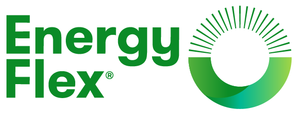
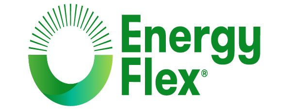
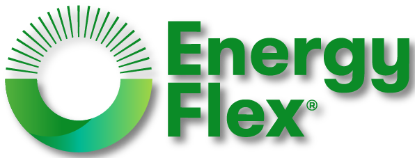
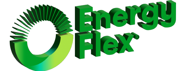
The EnergyFlex logo should be used only as supplied.
The following are examples of unauthorised usage of the EnergyFlex logo:
DO NOT

VISUAL IDENTITY
TYPOGRAPHY
Our brand fonts are Montserrat and Poppins.
Our headlines are MONTSERRAT BLACK,
UPPER CASE, -25 tracking.
Subheadings are Poppins Bold.
Paragraphs are Poppins 400 Normal, sentence case, 0 tracking. Paragraphs are Poppins 400 Normal, sentence case, 0 tracking. Paragraphs are Poppins 400 Normal, sentence case, 0 tracking. Paragraphs are Poppins 400 Normal, sentence case, 0 tracking. Paragraphs are Poppins 400 Normal, sentence case, 0 tracking. Paragraphs are Poppins 400 Normal, sentence case, 0 tracking. Paragraphs are Poppins 400 Normal, sentence case, 0 tracking.
Download brand fonts
Montserrat is available as a Google font, which provides ease of licensing and use across all team members and the Google suite of products. It is also available as an Adobe font with a relevant Creative Cloud subscription, however Google fonts are generally recommended to avoid licensing issues.
VISUAL IDENTITY
COLOUR PALETTE
This is the EnergyFlex brand colour palette.
Please ensure RGB and HEX values are utilised for digital usage and CMYK values are utilised for material that will be printed.
ENERGYFLEX BLUE
RGB
9 43 73
HEX
#092B49
CMYK
100 82 44 44
HOW DO WE USE THIS COLOUR?
EnergyFlex Blue can be used for all copy that sits on a white or green solid colour background. It can also be applied as a solid background colour for overlaid white text. For additional flexibility, tints of EnergyFlex Blue may be used in 10% increments between 10 – 90%.
GREEN
RGB
11 139 39
HEX
#0B8B27
CMYK
86 20 100 7
HOW DO WE USE THIS COLOUR?
EnergyFlex Green is used in the EnergyFlex logo and otherwise acts as a supporting colour.
ECO GREEN
RGB
5 164 100
HEX
#05A464
CMYK
82 8 82 0
HOW DO WE USE THIS COLOUR?
Eco Green is a supporting colour and is used across our suite of illustrations, digital and print assets. It may be sometimes used as a solid background colour, being careful to minimise usage of small type when overlaid to avoid accessibility issues. For additional flexibility, tints of Eco Green may be used in 25% increments between 25 – 75%.
WHITE
RGB
255 255 255
HEX
#FFFFFF
CMYK
0 0 0 0
HOW DO WE USE THIS COLOUR?
White is a supporting colour that can help give the feeling of space. It may be used as a solid background block with EnergyFlex Blue and Eco Green typography overlaid and is appropriate to use when typography is overlaid on EnergyFlex blue, Eco Green and photographic backgrounds.
BRAND ELEMENTS
SOCIAL MEDIA
EnergyFlex social media content is a mix of informative, product-related content, helpful lifestyle-related content to engage audiences and EnergyFlex related news.
Here is a template example if you require a co-branded social media tile. Please contact info@energyflex.com.au to request working files.
BRAND ELEMENTS
PHOTOGRAPHY
EnergyFlex photography is light, feels ‘natural’ and isn’t extensively edited. Here are some select photographs approved for use when talking about EnergyFlex.
Images can be downloaded by clicking the “Download high res image” and selecting “Save Image As” from the lightbox.
PRODUCT
UI ELEMENTS
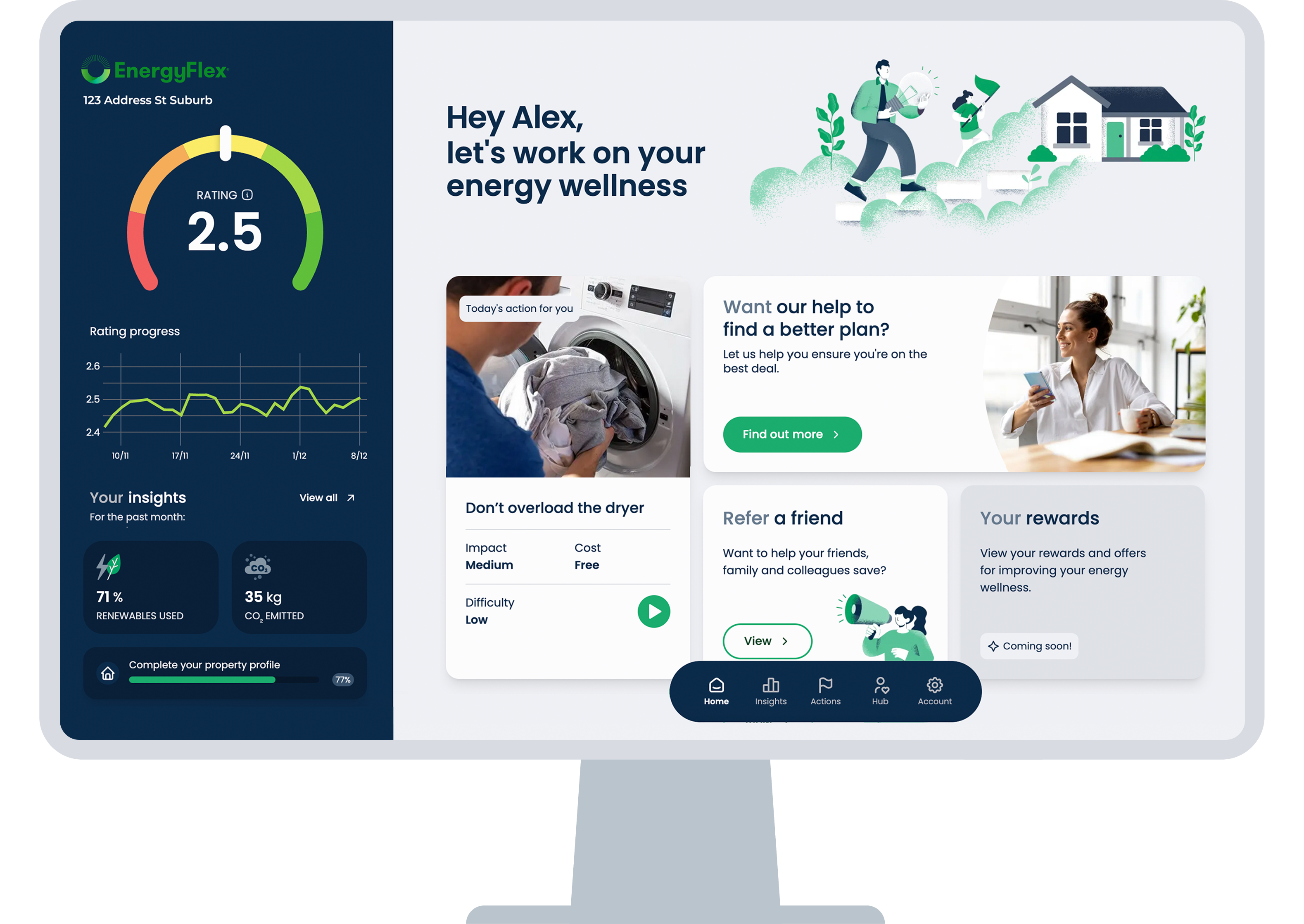
It can be helpful to utilise user interface imagery when explaining the EnergyFlex app. Here are some EnergyFlex-approved images of a number of product screens / features and EnergyFlex rating dials covering all possible ratings.
Please note – due to the ever-evolving nature of our product, these images will be updated periodically to reflect our current user interface and features. Please ensure you are always using the most recent version of these images.
Images in PNG format can be downloaded by clicking and selecting “Save Image As” from the lightbox.
Mobile App UI Examples
DESKTOP UI
ENERGYFLEX RATING
ASSETS
MEDIA
Here is a selection of EnergyFlex-approved images and written content that may be utilised in media coverage.
Images can be downloaded by clicking and selecting “Save Image As” from the lightbox.
TEAM PHOTOGRAPHY
APP DOWNLOAD BASEPLATES
These ‘app access’ lockups can be used across social media, print and digital executions as a quick link to to access the EnergyFlex app.
The colour versions below can be applied to a clear and solid colour background. They should not be applied to a busy or photographic background where the text, QR code or buttons become difficult to see or illegible.
CONTACT US
For additional requests or further guidance on use of the EnergyFlex brand guidelines, please reach out to the EnergyFlex team at info@energyflex.com.au


